
Why Aren’t Energy Flows Diagrams Used More To Inform Decarbonization?
Support CleanTechnica's work through a Substack subscription or on Stripe.
The US Lawrence Livermore National Laboratory (LLNL) energy flow Sankey diagram is something I use constantly in discussions, presentations, and consultations related to decarbonization, and to assist in my own analyses and thinking. It’s simple. Primary energy for an economy comes in the left. It’s split into its various areas of use — natural gas to electrical generation and heating for example — where the portion that isn’t lost to efficiency goes into energy services, and where the energy is just lost to waste heat, doing nothing useful for us.
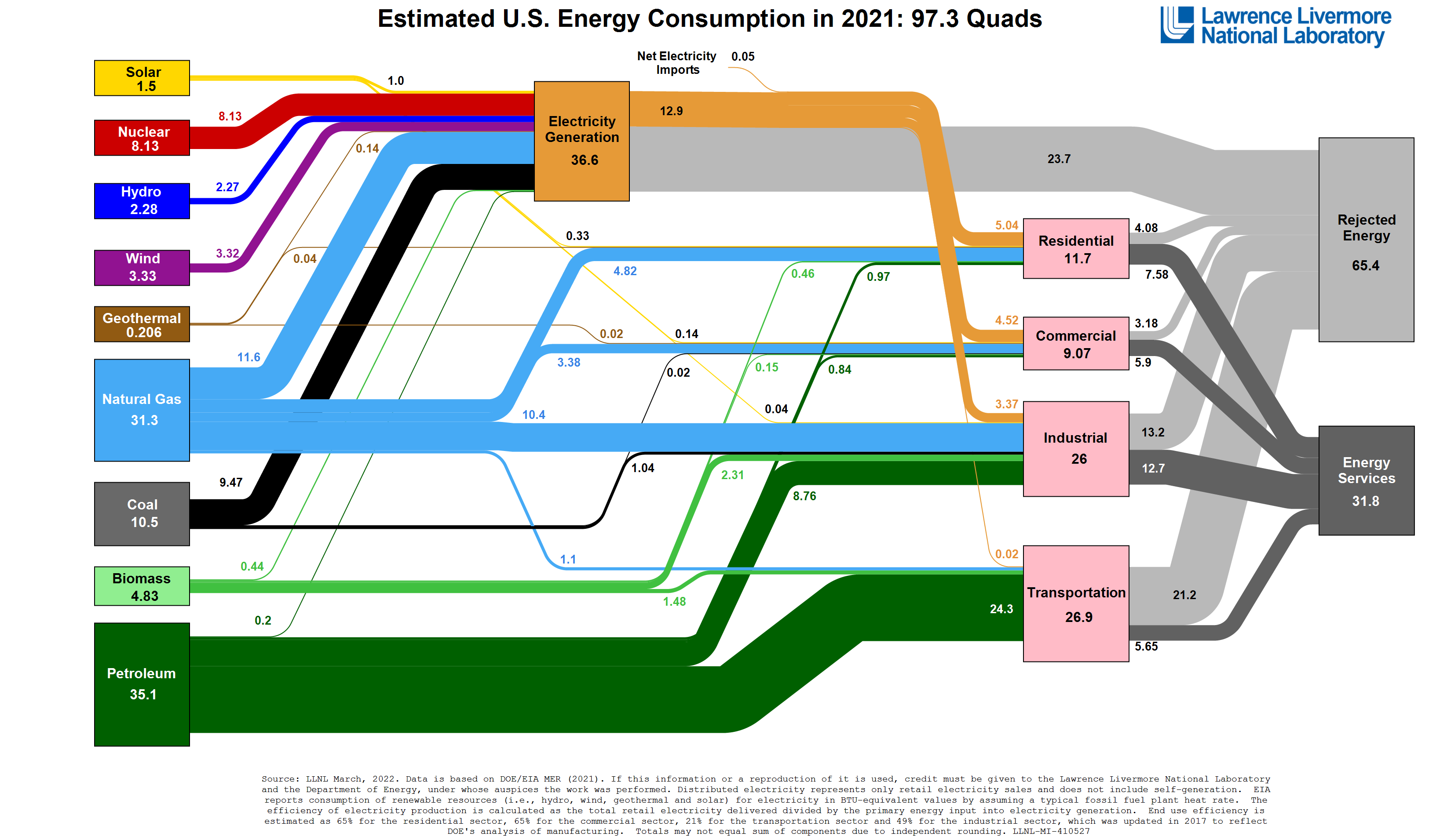
A month ago I spent some time working through its annual publication to assess how the US is doing. Answer: not good. I also wrote an explainer, leveraging ChatGPT as an experiment, on the significance of rejected energy. Energy flow diagrams are great for understanding overall energy efficiency, as the wasted energy, called rejected energy in the LLNL diagram, is clearly shown.
There’s something called the primary energy fallacy which far too many people fall prey to. Basically, the fallacy is the assumption that all of the energy in all of the oil, gas and coal we burn today must be replaced. We don’t need to replace it, we need to replace the unwasted energy services. Electrify everything is the mantra because using electricity in processes designed for it is always more energy efficient than burning something. That’s why it’s #1 on my short list of climate actions that will work. Internal combustion engines are really inefficient. Thermal generation is really inefficient. Electricity generated by a wind turbine being used in an electric motor or electric arc furnace is very efficient. That’s why rejected energy is two-thirds of all energy in the US.
Bill Gates’ favorite analyst, Vaclav Smil, only acknowledged rejected energy in 2021, presumably after a bunch of people like me pointed out that it was missing from his assessments, and as such they were far too pessimistic. 36 or 38 books worth of pessimism, in fact. This miss is part of why Bill Gates and the Breakthrough people often have been putting their money into the wrong things for well over a decade.

One of my current favorite examples of Sankey energy flow diagrams was created by David Cebon, professor of mechanical engineering at Cambridge and head of the Centre for Sustainable Road Freight (SRF) and a founding member of the Hydrogen Science Coalition. I published about the SRF’s most recent conference last month, where it was obvious that the politicians, OEMs, and academics focused on road freight are clear that battery-electric is the answer for road freight, not hydrogen fuel cells.
But Cebon’s Sankey diagram is about heat pumps and hydrogen. It makes it clear visually that using green electricity to make hydrogen for building heating would require at minimum six times the renewable energy as using heat pumps instead. Absurd amounts of rejected energy in the hydrogen scenario, and lots of energy from the environment using heat pumps. Even more expensive, of course, likely over ten times as expensive for each building.
I clearly love me some energy flow diagrams. So I was delighted recently when Samuel Vaillancourt, founder of the Canadian NGO Energy Calculator, reached out to see if I’d be interested in helping build a version and scenario calculator for Canada. He has a group of others involved and has been working on this with them since 2021 around their day jobs.
While the LLNL diagrams are amazing, useful, better structured, and more legible than the IEA equivalent (see the Canadian diagram which is an eye chart even on decent sized laptop screen), they are also static.

To do the analysis of change in the US over time, I had to manually transcribe the rejected vs non-rejected energy. There is no time analysis. The IEA diagrams have the ability to get time profiles for specific energy flows over multiple years, so the trends can be observed somewhat.
But neither is forward looking. Both are historically oriented. That’s useful, but it’s not as helpful for making decisions. This is why Vaillancourt and Energy Calculator are looking at the British example.

This is from the deprecated classic model from 2010, which was replaced with the Mackay Carbon Calculator in December of 2020. I was playing with the original model as many of the original team are people who Energy Calculator has talked to in assessing how much effort would be required for a Canadian version. Answer? Not very much, but more than something that some people can hack together off the sides of their desks if they want it to be of any use.
Why is this model interesting? Because you can make a bunch of selections of what the future will look like and get scenarios and results to assist in policy and planning.

There are some interesting things to note from this set of examples. One of them is that rejected energy is much more accurately depicted in the LLNL diagrams than in the others. The calculation of wind and solar is imperfect, but the diagram makes it much clearer how much energy we waste. Given our cognitive biases, that means energy planners and policy makers using the IEA and UK models (the Mackay model has the same problem) aren’t confronted with all of that waste and as a result don’t put sufficient focus on electrification. As Kahneman puts it in Thinking, Fast and Slow, what you see is all there is. If it’s not shown, 90% of the time our brains don’t add it.
So my first insight for the Energy Calculator team is that the energy flow results need to be like LLNL’s, not like the UK’s or IEA’s. Canada’s policy makers need to see the wasted energy in a big way, and they need to see that it shrinks massively in an electrified future. In the two examples from the 2010 calculator, the losses weren’t big and got smaller, but imagine the LLNL losses shrinking that much. That’s a visual story.
This is one of the head-scratchers about the Mackay calculator.

Yeah, the high ambition scenario has absolutely massive losses, while the today, business as usual scenario doesn’t. I suspect that’s a bug, as it makes no sense at all.
The 2010 UK model was also odd as it had only two choices for nuclear: none or absurd amounts. Hinkley was announced in 2010 along with seven others which are understandably stalled, and approved in 2012. Yet the 2010 model had no nuclear with the next increment being 30 GW of new nuclear. Not particularly useful. The Mackay model clearly is buggy, as the maximum ambition model has no wind or solar and absurd amounts of nuclear in the Sankey diagram, but wind and solar do show up in the underpinning selections. Given that Hinkley was already a debacle in 2020, far behind budget and far over schedule, a very optimistic scenario that’s very nuclear heavy is a weird choice, and likely ideologically influenced. Let’s see if I can make it deliver something more realistic.

That’s more like it. That’s an actually ambitious target, not the defaults for ambition in the Mackay calculator. What do those ambitious defaults include? Still lots of natural gas and absurd amounts of hydrogen for energy.
But that said, this model still has some odd quirks. The treatment of nuclear is merely different, not necessarily better. Hinkley is expected to be online sometime in the next couple of years, and is expected to operate until 2050, so that could be the baseline. But the model’s minimum nuclear capacity is 4.5 GW, so another big reactor or a couple of small ones would have to be added to the 3.2 GW of Hinkley. And even so, a scenario without nuclear at all would be useful to reflect upon.
For Canada, that’s relevant. Only two provinces of 10 provinces and three territories have nuclear plants. New Brunswick’s one reactor is going away, leading to all sorts of irrational behavior in the province like funding a perpetual motion seawater to hydrogen scam to the tune of $23 million CAD.
Ontario has an over abundance of nuclear in the mix, 58% of annual demand in 2021, with the result that there are regular surpluses that they have to pay neighboring jurisdictions to take off of their hands and they have to curtail what wind and solar farms they didn’t shut down when the Ford Conservatives ripped up 758 renewables contracts on entering office in 2018. All of those reactors are aging out, with the youngest being 33 years old.
Ontario has also contracted with BGE Hitachi Nuclear Energy for a 300 MW small modular reactor at the Darlington nuclear facility, and site prep is under way. That’s a first of a kind, by the way, only one has been contracted for so it’s giving up the advantages of building lots of them, and it’s also giving up the thermal generation advantages of GW scale, so the combination suggests it’s going to end very poorly for Ontario. I’m very dubious about SMRs being able to find an economically viable sweet spot on the size vs modularity curve. No modularity. No thermal advantages of scale. First of a kind. What could go wrong besides everything?
And new nuclear is much slower to build out than lots of wind and solar. The natural experiment of nuclear vs wind and solar I’ve been publishing on in China since 2014 makes it clear that if you want lots of low carbon electricity, wind, water, and solar are the way to go, not new nuclear reactors of any size. As Professor Bent Flyvbjerg points out in his just published book, How Big Things Get Done, solar, wind, and transmission projects are 1st, 2nd, and 4th of megaproject categories that hit time and budget targets, with offshore wind billion dollar projects in the deeply hostile North Sea and Irish Sea being completed in under a year, a staggering achievement given that a fast megaproject takes 4-5 years. Meanwhile, nuclear power generation is 23rd of 25 in projects that have cost overruns, usually massive. As a result, projections of deployments with nuclear in them have to have big error bars in any useful Energy Calculator visuals, or it’s simply misleading.
As a result, a Canadian calculator has to have a pretty nuanced view of nuclear. It should be possible to have no nuclear, as the SMR deployment in Ontario turning into a cancelled debacle is a very strong possibility, as well as being a one off that is not repeated.
One of the many oddities of the Mackay calculator is that as you add CCS for three hydrogen options, losses actually go down in the Sankey diagram, which is clearly wrong. CCS adds 15% minimum to losses. The Mackay calculator may just be displaying losses inaccurately in the Sankey diagram, but I suspect it has some deeply dodgy assumptions underlying it. Any CCS options in a Canadian calculator would have to include the losses for CCS, obviously.
The transportation file in the Mackay model is odd as well. Multiple scales of road transportation and aviation are included, but marine shipping, rail, and pipelines are missing in action. As marine bunkering is a problem of the same magnitude as aviation, it’s an odd mix. And while rail and pipelines are the lowest carbon form of ground transportation, they still consume a lot of energy. All should be included in any energy flows model as the pathways to decarbonization are different.
I just published a global assessment of four major geographies for rail decarbonization, and outside of the US electrification is the overwhelming winner. On that file, Canada could reasonably go its own way, as we have mostly a linear set of tracks that’s perfect to route the aforementioned HVDC along with only two carriers, CNR and CPR, along with a scattering of occasional use by some US carriers in places. Canada isn’t the US, so the federal government could actually build the HVDC grid and electrify the tracks, leaving CNR and CPR to convert their locomotives to run on overhead catenary and maintain and operate the catenary system. CNR also operates in 18 US states, or at least it did when it was my client a bit over a decade ago, but it’s an intelligently run firm and could figure it out. Full electrification of rail should be an option in the model.
For marine shipping, Canada has a massive inland shipping volume with Great Lakes and St. Lawrence Waterway, and of course has big ports on the east and west coast. In my projection of marine shipping refueling through 2100 I project that all inland and most nearshore shipping will electrify, mostly with port-charged containers of batteries that are shared with rail carriers as that mode electrifies. A third of nearshore and all deepwater shipping will go to biofuels in my well documented opinion. That should be in the model of course.
And pipelines mostly are going to go away. It’s not like hydrogen or synthetic fuels or biofuels are the future of pipelines, HVDC is the replacement for pipelines. The over 3 million miles of pipelines in the US and all of their energy, methane leaks, and spills are mostly going to be scrapped for steel, not be refilled with more molecules for energy. That’s part of the reason it’s so odd that British Columbia’s public employee pension fund just invested billions with Macquarie in the UK’s national gas grid and metering business, taking a 60% ownership position with an option on the last 40%. As a reminder, about 11% of all energy globally is used to extract, process, refine, and distribute fossil fuels, so as they disappear, the bonus needs to be added in.
On that note, in my assessment of the LLNL diagram it became clear that the energy wasted in extraction, processing, refining, and distributing fossil fuels was considered productive energy services as opposed to another form of rejected energy. After all, transmission losses for electricity are counted, so treating all of the energy embodied in getting fossil fuels out of the ground and to energy services should be counted as well. This is a hidden rejected energy story that I don’t think the Energy Calculator team should shirk from.
The Mackay model is also interesting because it’s impossible to get rid of natural gas and hydrogen. That’s deeply skewing the perspective. A natural gas-free scenario is a very reasonable thing to look for, and as the Cebon Sankey diagram shows, hydrogen is an absurdly expensive and lossy way to store and return energy, so it having a significant role in energy flows in the end scenario is deeply unlikely. While Canada’s fossil fuel industry is desperately trying to make hydrogen a carrier of energy so that they can make it from their soon-to-be-stranded fossil fuel reserve assets and attach expensive and lossy CCS to it at great public expense, Canada isn’t quite as embedded in the hydrogen for energy hype as Europe and clearly the UK is at present.
There’s another difference between the UK 2010 and 2020 models that’s worth noting. The 2010 model had the ability to add at least some transmission interconnects and pumped hydro. The 2020 model doesn’t. Strategic energy interdependence with HVDC interconnects is a major part of the energy solution of the future, and Europe is already pivoting toward that with Romania-Georgia, Morocco-UK, and Tunisia-Sicily interconnects green lit and in some cases started construction already. The UK already has eight HVDC interconnects to the continent, with a ninth under way, and is green lighting pumped hydro projects in Scotland, so this is a weird oversight in the Mackay model.
For Canada, that’s important. There’s a growing realization that the trans Canada energy corridor we need is an HVDC superhighway linking every province, with connections down into the US in multiple locations. We already have transmission interconnects in multiple places to the States and between provinces, but they need to get a lot bigger to allow Manitoba’s and Quebec’s hydro to be shared more broadly, to allow Canadian and US Prairies wind and solar electricity to be shared more broadly, and to give flat Saskatchewan more access to pumped hydro storage in neighboring provinces.
Canada, like the US, has massive pumped hydro potential due to the mountain ranges that are near each coast, but the center of the country is a bit of pancake. So maximizing pumped hydro and HVDC interconnects should be an option in the Canadian calculator.
What else? One of the limitations of the Mackay and 2010 calculators is that they both have a 2050 timeline in mind. As a result, they appear to make some pragmatic decisions about how little of some things like gas are likely to exist. I think that’s a weakness. Both the 2010 and 2020 calculators have four options for degrees of ambition, although clearly the Mackay one has some head-scratching assumptions about what constitutes ambition, and either 2050 should be the third level with the fourth being stretch, or a fifth stretch target should be added. A complete decarbonization option should be present. There’s pragmatism, and then there’s the climate crisis and actual ambition.
The IEA and LLNL models are good because they allow for historical perspective about the rate of change under different political, technical, and economic conditions. At minimum it would be good if Energy Calculator were able to get funding to update the baseline annually, and preserve the previous years’ reality in the model. The best case scenario would be if they could get sufficient funding to backcast to 1990, when decarbonization efforts started in earnest in other parts of the world. It wouldn’t be a pretty picture as Canada’s very energy and CO2e intensive oil sands were mostly developed after 1990, leading to a bleak result for Canada. In fact, Canada would have been well on our way to achieving our climate targets due to things like Ontario intentionally shutting down its coal generation in the 2000s if it weren’t for massive increases in emissions in Alberta and Saskatchewan. Similarly, we followed American car size escalation much more than Europe did, where vehicles remain much more reasonably scaled and more efficient.
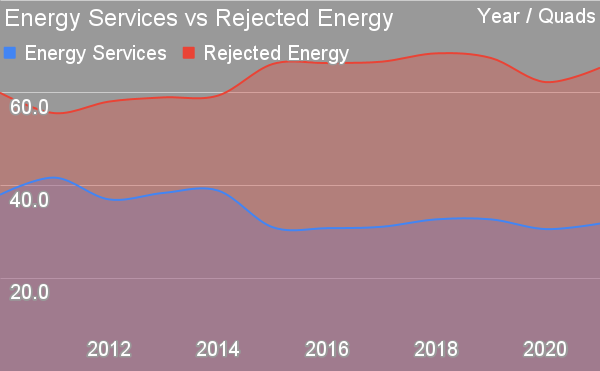
It will be important to get the model right the first time. This chart is the result of my historical assessment of America’s energy flows from the LLNL model. They adjusted it twice, as far as I could tell, with a major adjustment in 2015 that much more accurately reflected rejected energy. For a tool to be useful, it has to be accurate and for it to be useful year after year and for comparison of results, it can’t change so much that it loses value to look backward. The ability to see how the US was really doing was only valid from 2015, which isn’t much of a help. As a point, I consider the ratio of rejected energy to energy services to be a key national objective and key result (OKR) metric. It’s a key top level indicator of the degree of efficiency of energy use, and strongly supports electrification.
While I know the team has talked to some of the 2010 BEIS members, it would be good if they could talk to both the Mackay and LLNL teams, and look at the controversy over how wind and solar are calculated in the LLNL model. There’s a clear indication that the team is seriously interested in quality control, as the initial request to me was whether I’d be interested in testing the output.
One thing missing from the calculators is economic and population changes. A stagnant or fading economy will have very different energy growth scenarios than a vibrant and booming one. For the UK, leaving Brexit is the gift that keeps on containing a lump of coal. For Canada, we have a decent immigration program, about 20 times the scale of net immigration as the US as a ratio to population, but it should be aiming higher. And being next to an empire in decline and being tied to it economically is a major concern. It would be good to include a growth slider, as the country is going to change radically in some direction in the next three decades. Among other things, at today’s level of immigration, that’s another 12 million people, about a 32% increase by itself.
The last comment is that the Mackay model makes it clear that energy flow diagrams are political. What’s in, what’s out, how it’s counted, and whether an energy use is considered a service or a waste is subject to lobbying and bias. Certainly I expect to have lots of good creative conflict with other team members and stakeholders as the model coalesces, and I think I’ve staked out the major positions I hold in this piece. Canada is, after all, a country which has 5%-7% of its GDP directly related to the sale of fossil fuels, and is constantly sounding odd notes from the top levels about how fossil fuels are key to climate solutions.
The Mackay model, as one example of this, puts a lot of stock in mechanical carbon capture and sequestration schemes which are completely nonsensical in reality. There’s a reason why IPCC 6 has biological pathways to carbon draw down as the first, second, third, and fourth choices, and mechanical capture and sequestration at the bottom of the list. And there’s a reason why a global review of different countries’ plans around drawdown found that only fossil fuel producing countries were considering mechanical CCS instead of biological drawdown pathways. Yes, Canada will be pushing for CCS and pretending it’s viable despite its failure here in Saskatchewan at Boundary Dam.
And, to put a different political lens on it, four of Canada’s provinces are hoping, despite the lack of any actual products or proven performance, that small modular reactors will save their climate bacon, and Canadian firm Brookfield, which bought the bankrupt Toshiba Westinghouse a few years ago, is strong on small modular reactors. Lots of powerful people have a vested interest in nuclear as a pathway instead of the much cheaper and lower risk wind and solar generation pathway.
Of course, all of this is me thinking my way into the domain, most of it has likely been considered, and all of it may be in plan for Energy Calculator in any event. My engagement has been a few messages so far, and the first discussion is upcoming. And my obsession with Sankey diagrams and accurate and dominant visualization of rejected energy flows may not be aligned with the team. There are a lot of visualizations in both the 2010 and 2020 UK models that come before the Sankey diagram I consider so important. Further, I could find out, which would be dismaying, that the team is intransigently bullish on hydrogen for energy, nuclear, synthetic fuels, and CCS, and as such I would have to gracefully bow out (I suspect that’s not a big risk given that Vaillancourt reached out to me). It’s going to be fascinating to engage and work through priorities and the art of the possible.
UPDATE: We reached out to LNNL to ask researchers how they calculate wind and solar primary energy inputs in the Energy Flow Sankey diagrams, and what are the downsides and what are the alternatives?
Researcher Kim Mayfield replied that wind and solar generation comes from EIA data on energy production, and responded that “While the Sankey diagram is a visualization tool that inherently does not describe trade-offs for different energy production methods, I think it’s safe to say that the biggest downside for wind/solar is intermittency (i.e. lack of power production when wind isn’t blowing and sun isn’t shining). A promising complement is to add energy storage (e.g. batteries or pumped-hydro) to these production methods to overcome intermittency challenges.”
We have also reached out to the UK Department for Business, Energy & Industrial Strategy with some follow-up questions, and will update this article when we hear back.
Sign up for CleanTechnica's Weekly Substack for Zach and Scott's in-depth analyses and high level summaries, sign up for our daily newsletter, and follow us on Google News!
Have a tip for CleanTechnica? Want to advertise? Want to suggest a guest for our CleanTech Talk podcast? Contact us here.
Sign up for our daily newsletter for 15 new cleantech stories a day. Or sign up for our weekly one on top stories of the week if daily is too frequent.

CleanTechnica uses affiliate links. See our policy here.
CleanTechnica's Comment Policy