
Australia’s New Net Zero Report Is A Study In Bad Assumptions & Wishful Thinking
Support CleanTechnica's work through a Substack subscription or on Stripe.
Back in 2021, Australia launched a study about getting its economy to net zero by 2050, which is a laudable goal. Along the way, it appears to have been hijacked by people huffing hydrogen hopium. The April 19th, 2023 release projected a rather absurd growth in primary energy demand by 2050, with doubling of energy exports and 40 times the renewable capacity as today.
So let’s set the stage a bit for this, as it’s so absurd as to require context to explain it. First off, by 2050, all economies in the world will be consuming a lot less primary energy than today. The amount of energy we waste by burning fossil fuels is extraordinary. The USA’s Lawrence Livermore National Laboratory energy flow Sankey diagrams show it to be two-thirds of all primary energy as of 2022. As I noted recently, and as others such as Mark Z. Jacobson have been noting since the late 2000s, as we electrify everything possible, rejected energy plummets and so do primary energy requirements. My take was that the USA with renewables, heat pumps, and electrification of transportation, would require about half of the primary energy required today.

Unfortunately, Australia’s energy modeling virtually ignores rejected energy, but it does make it clear why Australia’s Net Zero scenarios are so oddly skewed. See that big gray bar at the very top of the equivalent energy diagram? Yes, Australia’s energy exports are four times their domestic consumption of energy. That’s why for close to a decade, the party in power was the party of coal, with PM Scott Morrison once bringing a lump of stuff into Parliament to tout its virtues.
As I pointed out in a recent article, Canada has a bit of a problem with the black stuff (and invisible gaseous stuff too) as it represents 5% to 7% of our GDP. But in Australia, it’s about 12%. And that’s direct revenue. Secondary and tertiary economic activity related to a primary economic component of that scale is as much again typically. Without fossil fuel extraction, processing and export, Australia’s GDP and standard of living drops significantly, potentially by as much as 25%.
And so, hopium ensues. As Paul Martin defines it, it’s the drug that is made out of our own hope to overcome our faculties and divert government money to things which aren’t useful. Hydrogen and hydrogen derivative energy exports from sunny and windy countries that are currently selling a lot of climate change problems are classic hopium.
So, the world’s economy is going to run a lot more efficiently in 2050 than it does today, with far less rejected energy. And every country in the world can manufacture a lot of its own energy because wind and solar work in most places, and they generate electricity, which can be used with very little rejected energy. And as I noted in another piece not long ago, HVDC transmission will be interconnecting regions with massive, low-loss transmission of energy, effectively becoming the new pipelines, oil tankers, and LNG tankers. There’s even a project in its earliest phases to connect Europe to Canada across the Atlantic, which isn’t even the longest underwater HVDC proposal of the past two years.
In this world of local generation of high-exergy electricity, low rejected energy, and no fossil fuels to speak of, will people be buying lots of hydrogen and derivatives to burn in local generation the way that they do coal, oil, and gas today? No, no they won’t. They’ll be vastly more efficient, energy imports will be miniscule by comparison, and countries which export massive amounts of fossil fuels today will not be exporting anywhere near the same amount of energy by then.
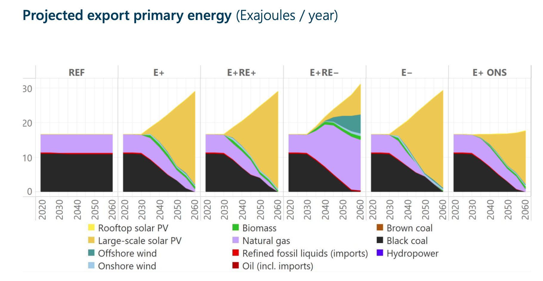
That’s what makes Australia’s entire Net Zero study a failure. Six scenarios, all of them with increased primary energy exports. The only realistic scenario is massive reduction in energy exports, and it isn’t even included as a thought exercise. Four of the non-business-as-usual scenarios manage to project an almost doubling of primary energy scenarios, which is a remarkable feat of combined optimism and delusion.
And as a result, the study has absurd costs and values associated with renewables.
“(The energy transformation) requires us to grow renewables as our main domestic and export energy source such that by mid-century we have 400-500 GW serving our domestic energy system and potentially several thousand GW producing energy exports, compared to roughly 25 GW today.”
Are either of the 400-500 or thousands of GW remotely accurate? Probably not even the 400-500 GW. After all, the biggest consumer of energy by far in Australia is the fossil fuel industry. That’s what happens when it’s 12% of an economy. It consumes the most fossil fuels. It consumes the most electricity. Without the fossil fuel industry, Australia’s energy consumption is going to plummet more than the 50% that the USA’s will with electrification.
Australia will eventually get back on track with HVDC interconnects, which I suspect will more rationally be to Indonesia and the Philippines than Singapore, with the Little Red Dot connecting to Indonesia and other ASEAN countries to share in the benefits. But it won’t be exporting 15,421 petajoules of energy via HVDC. That’s 4,300 TWh, after all. And that HVDC will be interconnects, bringing electricity to Australia as well as taking it away. Net exports will be nowhere near 4,300 TWh. After all, France, with its 24/7 nuclear reactors, eight neighboring countries that they can drive to, and interconnections in all directions, much bigger population and much bigger economy, still manages to be a net importer of electricity every year and only saw 35 TWh cross its borders in both directions in the first half of 2022.
Is there a silver lining for Australia? Yes there is. It mines a lot of minerals that aren’t fossil fuels and mostly exports them with minimal to no processing. It exported close to a billion tons of iron ore in 2022 and about 105 million tons of bauxite, the ore that turns into aluminum. As I note in my marine shipping projection through 2100, marine transportation fuel costs will go up, and so bulk shipping of unprocessed ores will go down, especially for iron as it will be processed with green electricity directly or through hydrogen, as I noted in my steel projection through 2100. However, the new steel market is going to decline as much more steel will be scrapped instead, with most of the world surpassing the USA’s current 70% supply from scrap through electric arc furnaces in electric minimills. Aluminum demand will remain strong, as among other things HVDC cables use it more than not, but it’s also an absurdly recyclable material. Australia as a result will be processing a lot more of its minerals onshore and shipping ingots in containers instead of raw ore in bulk shipping, and getting greater revenue per ton as a result. But that’s not going to replace the 12% of the economy that comes from fossil fuels.
I get that no country with big oil rents today can stomach the massive economic changes that are coming, with fossil fuel revenues plummeting by 2050 and 2060. But pretending that energy exports are going to double does Australia and Australians exactly zero favors. Not even acknowledging a scenario when energy exports are going to go down is so unhelpful as to be harmful.
UPDATE: Mea culpa.
For years, I’ve been calculating the fossil fuel industry’s contribution to GDP incorrectly. I’ve been using revenue as a ratio to GDP. That’s incorrect, and thankfully somebody finally corrected me.
It’s revenue less expenditures, notionally. This is is complicated, as it’s an aggregate measure for the entire economy, not looking at companies and their numbers and working up from the bottom. This explains my confusion with World Bank oil rents, natural gas rents, and coal rents numbers, where they calculate the percentage of a country’s GDP contributed by those products. As a result, I’ve overstated the percentage of GDP in this article (and several others, but this is the most recent one, so I’ll fall on my sword here.
As of 2020 (the latest year reported), the World Bank shows oil rents is 0.3% down from a peak of 2.8% in 1979, natural gas rents is 0.9% after a peak of 1.4% in 2018 and coal rents is 0.6%, down from a peak of 2.9% in 2008. That’s a total of 1.8%, not 12%. Given the energy crisis of 2022 driving prices and profits up, I expect all were higher last year.
Sign up for CleanTechnica's Weekly Substack for Zach and Scott's in-depth analyses and high level summaries, sign up for our daily newsletter, and follow us on Google News!
Have a tip for CleanTechnica? Want to advertise? Want to suggest a guest for our CleanTech Talk podcast? Contact us here.
Sign up for our daily newsletter for 15 new cleantech stories a day. Or sign up for our weekly one on top stories of the week if daily is too frequent.
CleanTechnica uses affiliate links. See our policy here.
CleanTechnica's Comment Policy