Climate Change Heads Off The Chart In 16 Seconds
Support CleanTechnica's work through a Substack subscription, on Patreon, or on Stripe. Help us produce all of the high-quality, original content we publish week after week despite the challenges of content-scraping AI, antisocial media, inflation, and other hurdles.
No need to wait very long for climate change to show up on the earth’s timeline. Climate scientist Ed Hawkins of the National Centre for Atmospheric Science at the University of Reading, UK (@ed_hawkins) posted this hypnotic moving image of climate change on Twitter this week.
Spiralling global temperatures from 1850-2016 (full animation) https://t.co/YETC5HkmTr pic.twitter.com/Ypci717AHq
— Ed Hawkins (@ed_hawkins) May 9, 2016
Hawkins participated in the fifth and most recent climate change assessment from the United Nations. His published GIF sequence shows a month-by-month full animation of global temperatures spiraling continuously upward from 1850 to the present. The data come from HadCRUT4.4 from January 1850 – March 2016, relative to the mean of 1850-1900. The Hawkins portrayal has taken the climate science world aback. It also promises to give ordinary people a strong and convincing shock.
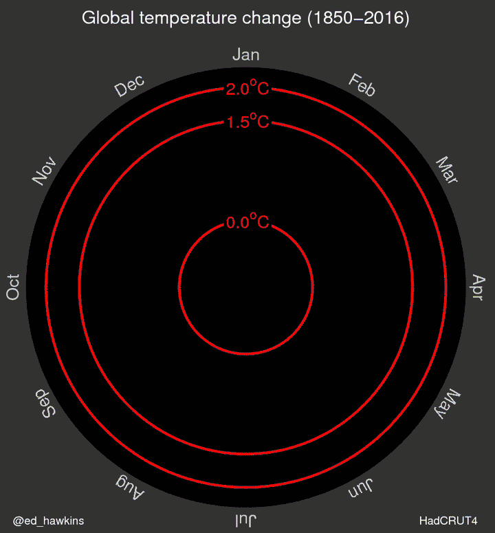
The infographic, which a Huffington Post article describes as “simple, gripping and alarming,” shows how the earth has progressively warmed over the past 150+ years. So far, it has had almost a thousand retweets. Gizmodo quotes Hawkins:
“I think there is lots to see—variations from month to month and decade to decade. I wanted to try and visualize the changes we have seen in different ways to learn about how we might improve our communication. The spiral appeared to present the information in an appealing and straightforward way.”
In his blog, Climate Lab Book, Hawkins describes meteorological and climate changes you can actually see unfolding:
- 1877-78: Strong El Nino event warms global temperatures,
- 1880s-1910: Small cooling, partially due to volcanic eruptions,
- 1910-1940s: Warming, partially due to recovery from volcanic eruptions, small increase in solar ouput and natural variability,
- 1950s-1970s: Fairly flat temperatures as cooling sulphate aerosols mask the greenhouse gas warming, and
- 1980-now: Strong warming, with temperatures pushed higher in 1998 and 2016 due to strong El Nino events.
How does this new visualization compare with the goals almost 200 nations set in the world’s historic Paris climate change agreement proclaimed last December and reaffirmed on the earliest possible date last month? The international conference posited a 2-degree Celsius warming limit as the desirable scenario by 2100. This change would still drastically impact the planet. Many climatologists agree on, and the international delegates have publicly aspired to, 1.5 degrees instead.
The infographic here shows that the 1.5 point has nearly arrived. The 2014 and 2015 consecutive records for the hottest year in recorded history back up this point, and with its major February jump, 2016 appears to be headed in the same direction.
Hawkins again, from the blog:
“The pace of change is immediately obvious, especially over the past few decades. The relationship between current global temperatures and the internationally discussed target limits are also clear without much complex interpretation needed.”
In other words, temperature jumped with unprecedented speed in the second half of 2015 and the first few months of this year. Its direction is inexorable and cannot be altered without immediate and concerted worldwide action.
Hawkins optimistically concludes that humans are largely responsible for past warming and thus have control over what happens next. We qualify: “limited control,” or perhaps “some influence.”
Sign up for CleanTechnica's Weekly Substack for Zach and Scott's in-depth analyses and high level summaries, sign up for our daily newsletter, and follow us on Google News!
Have a tip for CleanTechnica? Want to advertise? Want to suggest a guest for our CleanTech Talk podcast? Contact us here.
Sign up for our daily newsletter for 15 new cleantech stories a day. Or sign up for our weekly one on top stories of the week if daily is too frequent.
CleanTechnica uses affiliate links. See our policy here.
CleanTechnica's Comment Policy