1 Graph Says A Lot

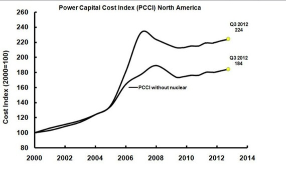
My good Twitter friend Alan Nogee recently shared an interesting graph with me. Frankly, we’ve probably written more about nuclear costs than is worth our time, so I’m not going to write a long piece here again. Here’s the graph (which I decided to title “nuclear premium”):
And here’s what market research company IHS had to say about it:
The IHS CERA Power Capital Costs Index (PCCI)
Leveraging the IHS CERA Index + Scenarios methodology, the PCCI tracks and forecasts the costs associated with the construction of a portfolio of 30 different power generation plants in North America. The PCCI tracks the costs of building coal, gas, wind and nuclear power plants, indexed to year 2000. The PCCI is a work product of the Capital Costs Analysis Forum for Power-North America, an annual renewable service managed by IHS CERA. For further information on the PCCI or the Forum, please contact Roger Kranenburg.
For related stories, see:
Solar Power Cheaper Than Nuclear In Cloudy Old England
Hinkley C Nuclear Power Plant To Get Twice The Rate As Solar PV From UK Government
Solar Less Than 5¢/kWh In Austin, Texas! (Cheaper Than Natural Gas, Coal, & Nuclear)
Scroll through our nuclear energy archives for even more. And subscribe to our cleantech newsletter to never miss a story.

Sign up for CleanTechnica's Weekly Substack for Zach and Scott's in-depth analyses and high level summaries, sign up for our daily newsletter, and follow us on Google News!
Whether you have solar power or not, please complete our latest solar power survey.
Have a tip for CleanTechnica? Want to advertise? Want to suggest a guest for our CleanTech Talk podcast? Contact us here.
Sign up for our daily newsletter for 15 new cleantech stories a day. Or sign up for our weekly one on top stories of the week if daily is too frequent.
CleanTechnica uses affiliate links. See our policy here.
CleanTechnica's Comment Policy


