7 Interesting Nuclear Energy Graphs
Sign up for daily news updates from CleanTechnica on email. Or follow us on Google News!
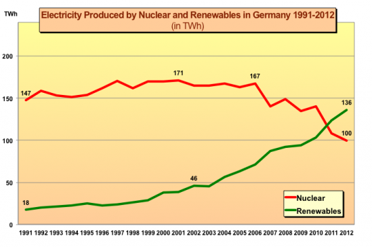
One of our readers recently passed along a couple of very interesting charts about nuclear energy as well as the nuclear energy report from which they came. The report, World Nuclear Report 2013, is well worth a more careful look, but for those who just love some interesting charts, here are the two that our ever-alert reader shared as well as a few more I pulled out:
I think the charts speak for themselves, but I’m sure they will stimulate plenty of commentary, so have at it.
Chip in a few dollars a month to help support independent cleantech coverage that helps to accelerate the cleantech revolution!
Have a tip for CleanTechnica? Want to advertise? Want to suggest a guest for our CleanTech Talk podcast? Contact us here.
CleanTechnica uses affiliate links. See our policy here.
CleanTechnica's Comment Policy
